

Here at Enplug HQ, there are Enplug-powered displays everywhere using internal Instagram hashtags to share the team’s weekend activities, displaying the latest news, weather forecasts, tracking the pulse of our brand on digital channels, and overall team communication and engagement.
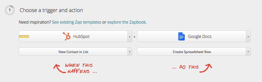
Enplug’s Webpage app also makes it easy to display dashboards on any screen, which can be easily controlled from anywhere. This functionality is useful for all types of dashboards from marketing to manufacturing metrics. I wanted to create an internal sales dashboard of our key performance indicators so that our developers, designers, and marketers alike could keep tabs on our progress. It keeps everyone up-to-date—and it keeps us motivated.
If you’re looking to improve upon your company’s internal communications with a similar dashboard display, this post will show you how I made it happen.
There are already lengthy resources online for best practices when creating a dashboard, so here’s my simplified overview:
1. Start with purpose: What gets measured gets better—so know your goals before you start.
2. Keep it simple: How much information can you remove while still having a useful dashboard? “Glanceability” is key.
3. Be flexible: Build your system so it can change and improve over time. Gather more information than you need so it can be used later.
Now let’s get started!
Creating Google Docs dashboards
1. Gather all data in Google Sheets
We use HubSpot to manage our growth metrics, and Shopify handles our sales transactions.
I recommend using Zapier to connect the systems you use to Google Docs. Zapier integrates with all of the web services we use to automatically copy data from one place to another.
For example, when a customer buys an Enplug device in Shopify, Zapier adds their purchase data to HubSpot and notifies the whole team via Slack.
I set up Zapier so that every new growth metric creates a new row in my Google Docs spreadsheet.
2. Summarize your data
Once you have your raw data automatically updating in Google Docs, you need to convert that data into a summary table.
The table below automatically counts the number of rows in the raw data using the COUNTIFS function. If you want to use numbers like dollar values, you can use SUMIFS to add together all the rows that meet your conditions.
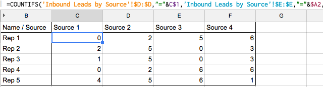
Using Countifs to summarize raw data. This formula counts all leads with Source 1 assigned to Rep 1.
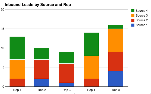
3. Graph It
Once you have a summary sheet like the one above, you’re ready to graph it! Google Spreadsheets has you covered with all the basic graph types you need. Simply select the range you want to graph and choose the type of chart. I’m using a Stacked column so I can see the breakdown of lead types assigned to each rep.
Displaying Google Docs dashboards on Enplug’s Webpage App
You should think about whether you want one or many charts on your Enplug screens. I have one crucial chart on my office screen that shows critical, actionable information that I can access anytime.
Either way, your first step is to publish the chart you want to display to a URL:
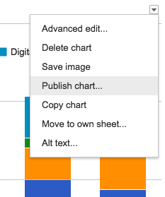
If you want to show one chart, use the Custom HTML feature and the following code.![]()
If you want to show multiple charts, you need to arrange all your graphs into one tab and publish the tab as a URL that you can input into the Webpage app.
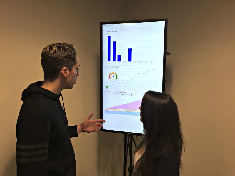
Enplug team members check out our progress!
Using Enplug’s Webpage app to display our dashboards has made a tremendous impact. This project helped me focus on the numbers that matter most to our teams and allowed me to collect all those numbers in one glanceable, actionable format. Now, I often see team members stopping by the dashboard on their way to the kitchen or ping-pong table to see the latest updates.